Sometimes only thinking about plants all day can get boring. I have been getting really interested in big data analytics, and business analytics, so I decided to see if methods I use in plant ecology could be applied to these fields. This tutorial goes through how to use Non Metric Multidimensional Scaling (NMDS) and K-means clustering to group survey responses using key words. This methodology is heavily reliant on researcher expert opion, and the output of this particular method will a) only contain as many clusters as specified by the researcher, and b) will only split data into clusters based off of chosen key words.
Lets make up some fake data!
Lets say you are trying to see how your product is percieved by first time users, so you generate an open ended survey where the respondents can describe the product. Lets say you asked something like:
‘What do you think about this product?’
Now you have a whole bunch of data, but you aren’t sure how to graphically display these responses without simply reading them. Here is an example of what you might do in order to group responses into categories, in a somewhat unbiased way. For this process to work you need to have some really specific objectives going into the project. For example, maybe you are really interested in seeing whether the extra money you put into redesigning the shape of your water bottles actually changes the perception of the consumer.
If you already have data that is formated correctly, you can skip this step. You want each column representing a repsondent, each row representing a word or key phrase, and each cell value representing a count of how many times a respondent said that word or key prase. Make sure to take a look at the matrix called ‘wordsXrespondent’ and make sure your data is formated the exact same way before you continue on to the next step.
#this could be anywhere from 5 to 1000 key phrases
#this depends on researcher's expert opinion.
words<-c('similar', 'different', 'nice', 'not_nice', 'I_like', 'bad', 'strong', 'weak', 'better','I_dislike')
#Note that none of these have spaces separating the words!
I separate my words with underscores instead. Having spaces in your key phrase could cause problems later.
#this assigns a number for each person in
#the list of respondents to a survey
respondent<-c(1:30)#this code generates a list of numbers
respondent #there are 30 respondents in this study
[1]  1  2  3  4  5  6  7  8  9 10 11 12 13 14 15 16 17 18 19 20 21 22 23
[24] 24 25 26 27 28 29 30
Now we can make a blank marix with no responses in it. I am filling the blank matrix with the ‘NA’ over and over, because it will be easy to see if I missed a cell in the process of filling it in later. The goal of this process is to make an empty matrix with the right number of rows and columns, named the correct way.
wordsXrespondent<-matrix(rep(NA, (10*30)),
 #repeat 'NA' to fill in the matrix
 nrow = length(words),
 ncol = length(respondent))
rownames(wordsXrespondent) <- words
colnames(wordsXrespondent) <- respondent
Great we have made an empty matrix. Now lets fill it in with the number of times each respondent said a particular key word. This is maybe one of the hardest steps of this process as a researcher, because you have to comb through your data to find each word and count the number of times it occured. This is where the function ctrl-F will be your best ally. 🙂 In my case I am just fiddling around trying to get the data to plot well. You could do something as simple as:
sample(1:50, 10*30, replace = TRUE)
However, this is what generated the best looking data for this tutorial:
for (i in 1:nrow(wordsXrespondent)){
 wordsXrespondent[i,1:5]<-sample(1:50,5, replace = TRUE)
#randomly pick a number between in a given range
#with replacement 5x
 wordsXrespondent[i,6:10]<-sample(0:20, 5, replace = TRUE)
 wordsXrespondent[i,11:20]<-sample(14:30, 10, replace = TRUE)
 wordsXrespondent[i,21:30]<-sample(15:28, 10, replace = FALSE)
}
wordsXrespondent[2,]<-sample(2:7, 30,replace = TRUE)
wordsXrespondent[3,]<-sample(9:10, 30,replace = TRUE)
wordsXrespondent[4,]<-sample(0:3, 30,replace = TRUE)
wordsXrespondent[5,]<-sample(3:100, 30,replace = TRUE)
wordsXrespondent[8,]<-sample(6:7, 30,replace = TRUE)
wordsXrespondent[9,]<-sample(6:7, 30,replace = TRUE)
wordsXrespondent
          1  2  3  4  5  6  7  8  9 10 11 12 13 14 15 16 17 18 19 20 21
similar   31 47 14 20 41 20 20 16 10  1 24 29 15 19 27 18 22 25 16 25 28
different  6  3  3  2  2  4  7  5  2  3  4  5  2  5  4  3  2  6  2  7  6
nice      10 10 10 10  9 10  9 10  9 10 10  9  9  9 10  9  9 10 10 10 10
not_nice   2  3  3  3  1  2  0  1  2  3  2  2  1  3  2  2  0  2  1  2  3
I_like     4 31 79 65 34 77 31 60 74 90 93 10 24 56 49 68 33 17 20 85 28
bad       13 19 21 39 44 16 16 17 18  0 30 28 22 30 30 26 22 17 15 30 16
strong     2  6 34 50 45 16 17  0 11 12 14 15 28 19 18 30 18 30 16 14 17
weak       6  7  7  6  6  6  7  6  7  7  6  6  6  6  7  7  7  6  7  6  6
better     6  6  6  7  7  7  6  6  7  7  7  7  6  7  7  7  7  6  7  7  6
I_dislike 38 33 46 50 43  1 10 16  1  7 16 14 26 28 27 22 29 18 26 18 16
          22 23 24 25 26 27 28 29 30
similar   25 16 17 22 27 23 21 26 24
different  6  6  3  6  5  6  5  7  5
nice       9  9  9 10  9 10 10 10 10
not_nice   0  1  0  3  2  2  2  0  3
I_like    40 71 90 94 60  3 42 10 78
bad       25 26 15 18 21 17 22 28 24
strong    27 21 19 20 16 23 28 26 22
weak       7  7  6  6  7  7  7  6  7
better     7  7  6  7  7  6  6  7  7
I_dislike 25 21 23 15 19 26 27 18 17
#Kmeans
I am going to keep things really simple here, but keep in mind I am making several arbitrary decisions, which could influence how the data are clustered! Please check out Vicky Qian‘s page for more information on how K-means works in a keyword search.
First, I am choosing euclidiean distance as a distance metric, because it is very simple to conceptualize. In 2D, the euclidean distance between two points is the straight line distance between two points. It is defined by they pythagorean theorem: c^2 = a^2 + b^2
So the straight line distance (c) is:
c = (a^2 + b^2)^.5
So in the case of our data. The straight line distance between respondent 1 and respondent 2, when considering only the key phrases ‘similar’ and ‘different,’ would be calculated using the difference in the ‘similar’ dimension and difference in the ‘different’ dimension. Then you calculate the straight line distance between these two points using:
c = ((x_1-x_2)^2 + (y_1-y_2)^2)^.5
You could visualize this with a line connecting these two responses in 2D:

This allows us to define each respondent in terms of their responses, and calculate how different their reponses are. There are other distance metrics, which may better represent your data!
#install.packages(vegan)
library(vegan)
#Calculate the euclidean distance between your respondents.
dissimilaritymatrix <- dist(t(wordsXrespondent),
 method = "euclidean")
#Take a look at the dist object 'disimilaritymatrix' if you
#are curious what that looks like.
k_clustering<-kmeans(dissimilaritymatrix, 4)
#cluster the data into 4 clusters
#THE SELECTION OF CLUSTER NUMER IS ARBITRARY HERE!
#For more information on how to decide how many clusters
#to use please read Aho et al. 2008!
k_clustering #look at the output
K-means clustering with 4 clusters of sizes 7, 6, 10, 7

Cluster means:
         1        2        3        4        5        6        7        8
1 32.22623 33.84944 73.47725 67.90170 43.86001 72.30457 35.07826 58.13962
2 63.93689 44.73111 37.24351 46.70883 53.02462 30.95846 35.91660 22.50176
3 87.82668 67.20572 36.23126 50.90746 70.48799 27.39988 58.05936 38.59590
4 40.28872 34.29155 56.01916 56.21881 45.60066 52.40519 17.38793 38.98359
         9       10       11       12       13       14       15       16
1 72.56554 90.00110 82.45616 24.81139 30.21985 49.04800 41.82026 59.95336
2 31.45077 47.64580 35.89252 53.50887 40.95343 14.82415 17.95495 17.64255
3 29.98810 36.02561 25.47851 77.93967 64.04199 37.94180 43.89556 29.83262
4 51.81252 68.82095 64.46390 28.90674 16.18571 29.54213 24.51353 39.72697
        17       18       19       20       21       22       23       24
1 31.48356 24.97185 29.27166 74.67052 29.41926 35.29555 62.59324 80.03704
2 31.22993 48.25951 44.22037 28.86794 37.43086 26.30458 16.15566 33.56572
3 56.25904 70.87133 67.89814 24.24588 60.95045 50.24084 26.69234 23.69082
4 13.93023 21.64716 17.62226 56.74793 15.93036 15.66477 42.05718 60.22881
        25       26       27       28       29       30
1 83.46593 51.43158 24.92034 37.75757 23.38987 67.83262
2 36.95582 14.87974 59.94118 25.42135 53.41489 22.48768
3 23.84934 34.10801 83.62184 48.32583 77.34546 23.02437
4 64.31366 32.15700 30.65356 16.22430 27.13731 48.64856

Clustering vector:
 1  2  3  4  5  6  7  8  9 10 11 12 13 14 15 16 17 18 19 20 21 22 23 24 25
 1  1  3  3  1  3  4  2  3  3  3  1  4  2  2  2  4  1  4  3  4  4  2  3  3
26 27 28 29 30
 2  1  4  1  3

Within cluster sum of squares by cluster:
[1] 23181.00 10594.74 38912.41 10235.42
 (between_SS / total_SS =  77.8 %)

Available components:

[1] "cluster"      "centers"      "totss"        "withinss"
[5] "tot.withinss" "betweenss"    "size"         "iter"
[9] "ifault"
k_clustering$cluster #See what cluster each surveyed person is in
1  2  3  4  5  6  7  8  9 10 11 12 13 14 15 16 17 18 19 20 21 22 23 24 25
 1  1  3  3  1  3  4  2  3  3  3  1  4  2  2  2  4  1  4  3  4  4  2  3  3
26 27 28 29 30
 2  1  4  1  3
This shows what cluster each respondent has been assigned to. You can use this information later to look at these groups in reduced dimensions
#NMDS
Ok now lets look at what the groups of data look like in reduced dimension space. This fuction is taking all of your multidimensional information, where each person is being represented by a whole set of key terms, and reducing it to two dimensions. Other people do a much better job of explaining NMDS than I do, so check out Jon Lefcheck and GUSTA ME. They have some great resources!
set.seed(1) #This fixes the randomization process, so you can replicate your results.
#Normally, every time you re-run iterative methods like NMDS, your output
#will be different. set.seed Prevents this
nmds_count <- metaMDS(dissimilaritymatrix, k=2) #run NMDS
i = 1
col<-NULL
k_clusteringclust<-as.matrix(k_clustering$cluster)
for(i in 1:30){
 if(names(nmds_count$points[,1])[i] == rownames(as.matrix(k_clustering$cluster))[i]){
 col[i]<-k_clusteringclust[i]
 }
}
#Assign each cluster a color to distinguish them.
for(i in 1:30){
 if(col[i] == 1){
 col[i]<-'#a6611a'}
 if(col[i] == 2){
 col[i]<-'#dfc27d'}
 if(col[i] == 3){
 col[i]<-'#80cdc1'}
 if(col[i] == 4){
 col[i]<-'#018571'}
}
Yay! Now lets graph our NMDS dimensions.
fig<-plot(nmds_count, type = 'n')
points(fig,
 what = "sites",
 col = c(col),
 pch = 19)

Now you have a figure that shows how groups of survey responses can be split up using key words. The dots represent people. The groups of responses are shown by the color. Lets add hulls to show the groups more clearly!
fig<-plot(nmds_count, type = 'n')
points(fig,
 what = "sites",
 col = c(col),
 pch = 19)
ordihull(fig,
 draw = "polygon",
 border = NULL,
 alpha = 100,
 k_clusteringclust[,1],
 col = c('#a6611a','#dfc27d','#80cdc1','#018571'))
 Lets plot the same thing, except now lets include important key words. These specific key words are indicators of separation between groups. They indicate how these groups communicate about the product differently. They are statistically significant indicators at alpha = .01. This is defined by the p.max argument in the plot function.
fit<-envfit(nmds_count$points,t(wordsXrespondent))
fig<-plot(nmds_count, type = 'n')
points(fig,
 what = "sites",
 col = c(col),
 pch = 19)
ordihull(fig,
 draw = "polygon",
 border = NULL,
 alpha = 100,
 k_clusteringclust[,1],
 col = c('#a6611a','#dfc27d','#80cdc1','#018571'))
plot(fit,
 p.max = .01,
 col = 'black',
 cex = .5)
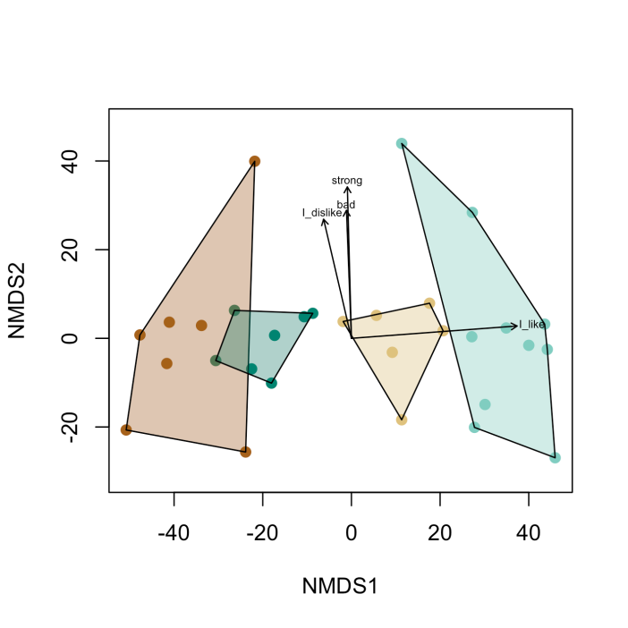
The arrows with text show the most important phrases, which characterize the group the arrow points at. In this case the sage-green cluster would have more individuals that like the product.
What can we conclude from this graph?
I would say that you made the bottle too strong. The people who said that the material was strong also disliked the bottle. This is bad news, because it means you will have to rethink how you make your bottles. But, it is also good news, because you can build a thinner bottle and save money on materials in the future.
Works cited:
Aho, K., Roberts, D. W., & Weaver, T. (2008). Using geometric and non-geometric internal evaluators to compare eight vegetation classification methods. Journal of Vegetation Science, 19(4), 549-562.
